
May 21, 2022
Background
In this project, i will analyze and redesign the GUI of the virtual exhibition at the Louvre Museum using key theories, terms, and concepts in Cognitive Interaction.
This was one of my first projects at university. Alot has improved since then, mainly how i conduct interviews and structure questionnaires. But i'm still proud of my then Adobe XD abilities and how i implemented the different principles for cognitive interaction, especially considering the timespan.
Description
The artifact in question is a user interface designed to navigate a virtual representation of a small section of the Louvre Museum in Paris. It consists of various elements placed at their respective locations within the virtual space. To explore these artifacts, a navigation system is employed, as depicted in Figure 1.
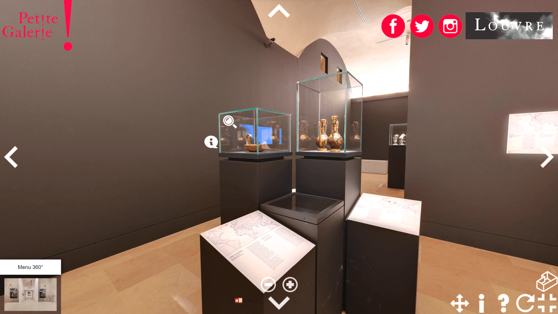
Figure 1 - Depicts a part of Louvre Museum with different GUI elements ontop
This navigation interface comprises several icons and symbols that facilitate user interaction. Positioned on the sides of the interface are multiple white arrows, which represent the user's ability to pan around in a 360-degree fashion—up, down, left, and right. Clicking on one of these arrows causes the camera to rotate in the chosen direction until the user releases the button. Directly beneath the bottom arrow, there are two additional buttons for zooming in and out of the view.
In the upper left corner, there is a red logo for "Petite Galerie," which allows the user to navigate to their page. The upper right corner contains several red icons representing the museum's presence on various social media platforms, allowing the user to visit them as desired. Adjacent to these icons is the Louvre's logo, which provides a link to the museum's website.
In the lower left corner, there is a box labeled "Menu 360°." Just below the title, there is a small image of the entrance. Clicking on this box triggers the appearance of a new box that slides up from the bottom of the screen, extending horizontally across the screen. This menu bears the title "Faites défiler les photos et cliquez pour charger les photos et vidéos 360," translated as "Scroll through the pictures and click to load 360-degree photos and videos." Directly beneath this title are several images representing different sections of the museum. Arrows at the edges of the menu guide the user to scroll through these sections.
At the lower right corner, there are several translucent white icons for various settings and information options. These include information about "Petite Galerie," details about the 3D interface, the option to toggle auto-rotation on or off, full-screen mode, and a setting for smoother mouse navigation.
In addition to these 2D icons, there are several 3D icons that guide users to different positions within the 3D environment. These white circular icons have subtle animations and are placed at various locations where users can click to navigate further in the 3D world. The last of these 3D icons is similar to the "Menu 360°" and is positioned near the user's feet, allowing users to revisit different sections of the museum, this time in the 3D space around them.
Analysis
Many of these elements are ethically pleasing and possess several positive cognitive aspects, yet they require further refinement to achieve a higher level of cognitive efficiency.
Positive
Taking a closer look at some of the positive aspects of the interface, we can start with the translucent white buttons. These buttons exhibit a sound color coding practice as they share a common color, aiding users in understanding their collective role within the 3D world's navigation and settings—a concept known as shared color grouping in design patterns (p. 16 & 58).
Similarly, the social media buttons excel by adhering to a consistent color scheme in red, employing proximity grouping, and maintaining horizontal alignment. They also adhere to Gestalt's Law of Proximity. Moreover, they adhere to the Law of Similarity, given that these objects share the same shape, further reinforcing the user's understanding of their interrelatedness. The only drawback is that these buttons may be inadvertently associated with the Petite Galerie button due to their identical color coding.
When it comes to mapping, the placement of the directional arrows is thoughtfully designed, aligning with human natural vision. The up and down arrows are positioned at the top and bottom of the screen, while the left and right arrows are situated on the respective sides of the screen.
Another commendable aspect is the artifact's constraints, particularly in terms of the available 3D positions for the user. This represents a physical limitation, with specific positions available for user interaction (p. 144, Norman). Additionally, the 3D positions employ signaling through animations to convey their clickability (p. 14, Norman). They also adhere to the common principles of motion within the Gestalt laws, employing consistent animations, which enhances the user's comprehension of their relatedness and shared function (p. 124).
Regarding color semantics, it is notable that red "X" icons appear when various tool icons and information bubbles are clicked, signaling to the user that the action will result in closure.
The tool icons employ different conceptual models to describe their functions. For instance, an "i" is used to signify information—a concept that users would have acquired through prior experiences and knowledge. Similarly, a "?" represents help, a circular arrow denotes autorotation, and a button with four ┏ shapes in each corner signifies fullscreen mode. The latter also employs the principle of simplicity, as it consists of four objects at different angles, but their relationships make them appear as a square.
Settings-bar
Fourarrows for navigation
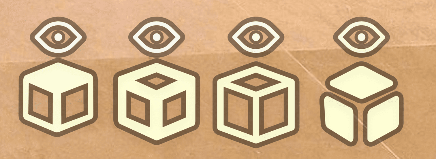
Figure-? Also utilizes Gestalt laws such as "The Law of Good Continuation" and "The Law of Similar Size, Surrounding, Angle, and Symmetry." The Law of Good Continuation is evident when it visually appears as if lines with arrows on each side are crossing over one another, rather than two "L"-shaped figures with arrows on each side crossing over. The Law of Similar Size, Surrounding, Angle, and Symmetry comes into play when an object primarily occupies the size of the background. If it were the opposite, it might suggest that there are four arrows pointing towards a central point, as depicted in Figure-?.
The Closure Principle is observed in the moving image icons, which consist of a magnifying glass frame with a separate element in the form of a shiny glass. Together, they form a magnifying glass.
Affordance is created through the interface's buttons and the computer's input system (mouse or touchscreen). This allows users to navigate within the virtual world by altering the viewpoint of various objects within the museum from all 360 degrees.
Patterns for Design
Design patterns involve various graphic elements having a relationship with one another based on a common graphic feature as a foundation. This helps users understand that these elements are interconnected. These features can range from having a common contour, proximity grouping, sharing the same alignment, common motion, being enclosed in the same outline, shared color areas, shared texture areas, and more (p. 58).
Color Coding
Color coding is a method for mapping and differentiating various pieces of information. This helps users quickly identify the part of information they are seeking while separating the remaining information, making it less prominent when it is not in focus. A good example of this is in the mapping of this interface, where different colors are used to represent different regions of the country (p. 77).

Mappings
Mappings entail the correspondence between the artifact's controls and the user's actions in a logical manner. This can vary from individual to individual based on their previous experiences and cultural backgrounds. An example of this is the volume buttons on a TV remote control, where logically, the up button should be above the down button (p. 41–42).
Constraints
As the name suggests, constraints are limitations within the artifact, whether they are physical, logical, semantic, or cultural constraints. These serve to guide the user more easily through the system and also to minimize the risk of accidents (p. 72, Norman).
Signifiers
Signifiers, or signals, are just as they sound—they are various cues that guide the user to different actions and possibilities that can be performed within the artifact or environment. These signals can be unintentional, like a trail in the woods created by previous people walking there, eventually forming a path. They can also be intentional, like doorknobs with the word "pull" to signal to the user that the door needs to be pulled to open (p. 14, Norman).
Color Semantics
Color semantics refer to what a specific color represents, which can vary between different cultures. For example, white represents cleanliness in the Western world, while in Asia, it signifies mourning (p. 84–85).
Conceptual Models
Conceptual models refer to various explanations that make it easier for users to navigate an artifact, system, or environment based on previous experiences, knowledge, culture, or metaphors. For example, how people use computers today involves the system calculating various binary codes to achieve what the user wants. However, instead of visually displaying the binary code, it presents a graphical system in the form of folders, icons, files, and more. This helps users navigate the system by representing the binary code with metaphors from the real world. Another good example is sending emails. Users aren't actually sending physical letters, but it is represented as such to aid in understanding how the system functions (p. 25).
Affordance
Affordance encompasses the various interaction possibilities that humans have with an artifact or environment based on the properties of the artifact or environment itself (p. 72, Norman).
Shortcomings
To address some shortcomings and areas where the artifact could be further developed, we can revisit the analysis of the white buttons. As previously mentioned, these buttons are aesthetically pleasing, but they fall short in terms of pop-out effect. This is because the majority of the walls and floor in the 3D space have a lighter shade of white, which minimizes the pop-out effect on these elements, ultimately diminishing their discoverability (p. 29 and p. 91, Norman).
Another aspect where the entire interface falls short is in providing feedback to the user during various button presses. While actions occur when the user interacts with different elements, there is minimal visual change on most of the buttons to indicate that they have been pressed. The only exception is with system buttons that receive a small, inconspicuous checkmark icon, which can be challenging to discern due to its small size compared to the rest of the elements (p. 91, Norman).
A visual interference issue arises with the Louvre icon, where the background texture is black with a stark white smoke cloud that makes the white text difficult to discern (p. 51).
Pop-Out Effect
The pop-out effect occurs when an object stands out from the surrounding objects, primarily because the pop-out object has one or more features that distinguish it from several other objects that are similar or identical to each other (p. 29).
Feedback
Feedback is when the artifact communicates that one or more actions have been taken or the current state of the artifact (p. 23, Norman).
Visual Interference
Visual interference occurs when two or more overlapping elements have too similar visual attributes, making the elements difficult to distinguish. To avoid this, all attributes must differ significantly from each other to become visible (p. 51).
Discoverability
Discoverability refers to how easily users can discover the various interaction possibilities within an artifact or environment. This information is conveyed through different conceptual models, affordances, signals, mappings, and constraints present within the artifact or environment (p. 91, 141, 142).
Gestalt Laws
Gestalt laws are a collection of different principles that explain how certain perceptual abilities are more likely to occur than others (p. 123, Visual Perception).
Law of Proximity
This law states that when several objects are in close proximity to each other, our brains subconsciously group them together (p. 123, Visual Perception).
Law of Similarity
This law states that when two or more objects are similar to each other, we tend to group them together. This perceptual ability also tends to override the Law of Proximity (p. 124, Visual Perception).
Law of Common Fate
When two or more objects move in the same direction and at the same speed, our brains perceive these objects as being grouped together. This can be compared to how things behave in nature, such as birds flying in a flock (p. 124).
Law of Good Continuation (Continuity)
This law suggests that we tend to perceive the natural continuation of an object rather than abrupt changes (p. 125). This can make a wavy "X" symbol appear as two lines crossing over each other (see image below for example).

Law of Closure
This law implies that several objects can come together to create a larger whole based on their relationships and structure to each other. This can be achieved by using the other laws within the Gestalt laws to create closure (p. 125).
Law of Similar Size, Surrounding, Angle, and Symmetry (Grouping)
The interaction between one or more objects and the background's four attributes—size, surrounding, angle, and symmetry—can create a whole. An example of this is the image below.

Thanks to the four triangles being positioned at a specific angle, being symmetrical, and being surrounded by a background larger than the objects, these objects tend to be perceived as a propeller together (p. 125–126, Visual).
Law of Prägnanz (Simplicity)
The Law of Prägnanz is based on the principles that humans perceive images that are simple and complete rather than complex and incomplete. When we analyze multiple objects, we also include their relationships with each other in terms of proximity, similarity, closure, continuity, closure, and grouping. Using these principles, a new complete object can be created (p. 127, Visual). A good example of this is emoticons like ": -)"—we don't perceive them as four separate objects but rather as a whole in the form of a happy face.
Development
Improvements
To create the improved artifact, the shortcomings identified during the artifact analysis serve as the foundation for the desired enhancements. In summary, the artifact lacks:
1. Providing user feedback in the form of indicators during various button presses.
2. A noticeable pop-out effect, as several icons have a similar color to the objects and the background around them, creating visual interference.
3. Visual disturbances within the Louvre icon due to similar colors used for the text and background.
4. The potential association of social media buttons with the Petite Galerie due to their shared color coding.
To address the first shortcoming, the various icons will be enhanced upon button presses. This will involve stronger coloring and an increase in shadowing around these objects.
By adding a black border around the transparent white icons, these objects will become more discernible on any background.
The Louvre icon will also be scaled down, given a similar background, and framed like the other objects.
Other improvements that will be implemented include enhancements for the "Menu 360 Degrees," bird's-eye view icon, and +/- buttons, as these have few attributes that convey their functionality. Improvements for these tools will include:
1. Renaming "Menu 360 Degrees" to something more concrete, such as "Sections."
2. Updating icons using conceptual models to increase understanding of their functionality.
3. Placing the plus and minus buttons within the toolset and orienting them vertically, as this aligns better with the logical mapping within the 3D world.
Different Design Proposals
There were several different design proposals for this artifact. These design proposals will be evaluated through user testing to gain a better understanding of which one conveys the functionality best.
Louvren and Petite Galerie Icons

For these icons, there were two alternatives. One with text only and a border around the text, while the other proposal has an enclosing contour.
Menu 360 Icon


Instead of text, this is replaced with an icon using a conceptual model in the form of a magnifying glass, maps, and map pins.
Bird's-Eye View Button
Improved concept

User Testing
Each participant was given the opportunity to test the original artifact and then the improved artifact. While testing these artifacts, questions were asked about each icon, the shortcomings of the artifact, and how they perceived the discoverability of all elements.
Results from User Test 1
Original Artifact
The image button for the different artifacts was difficult to interpret because the user felt that it implied zooming in on the object.
The social media icons were perceived as belonging to Petite Galerie due to their shared color coding.
The functionality of the 3D icon was unclear at first glance (understood after interacting with it).
"Menu 360" was unclear as the name did not align with its functionality.
"Menu 360" also had thumbnails that were too small to be useful.
There were few indicators during button presses.
The user did not understand what the "more glide button" was or what purpose it served.
Improved Artifact
Had better indicators.
The user felt that the "Menu 360" button explained the functionality better, and their preference among the different proposals was the one with a magnifying glass with a pin inside of it.
The 3D buttons better explained the functionality, as the user used an eye as a metaphor for seeing the building from above. However, they still wanted something that signaled the functionality more explicitly, like text saying "3D." After further discussion, these sketches were developed into the final design.
Sketch
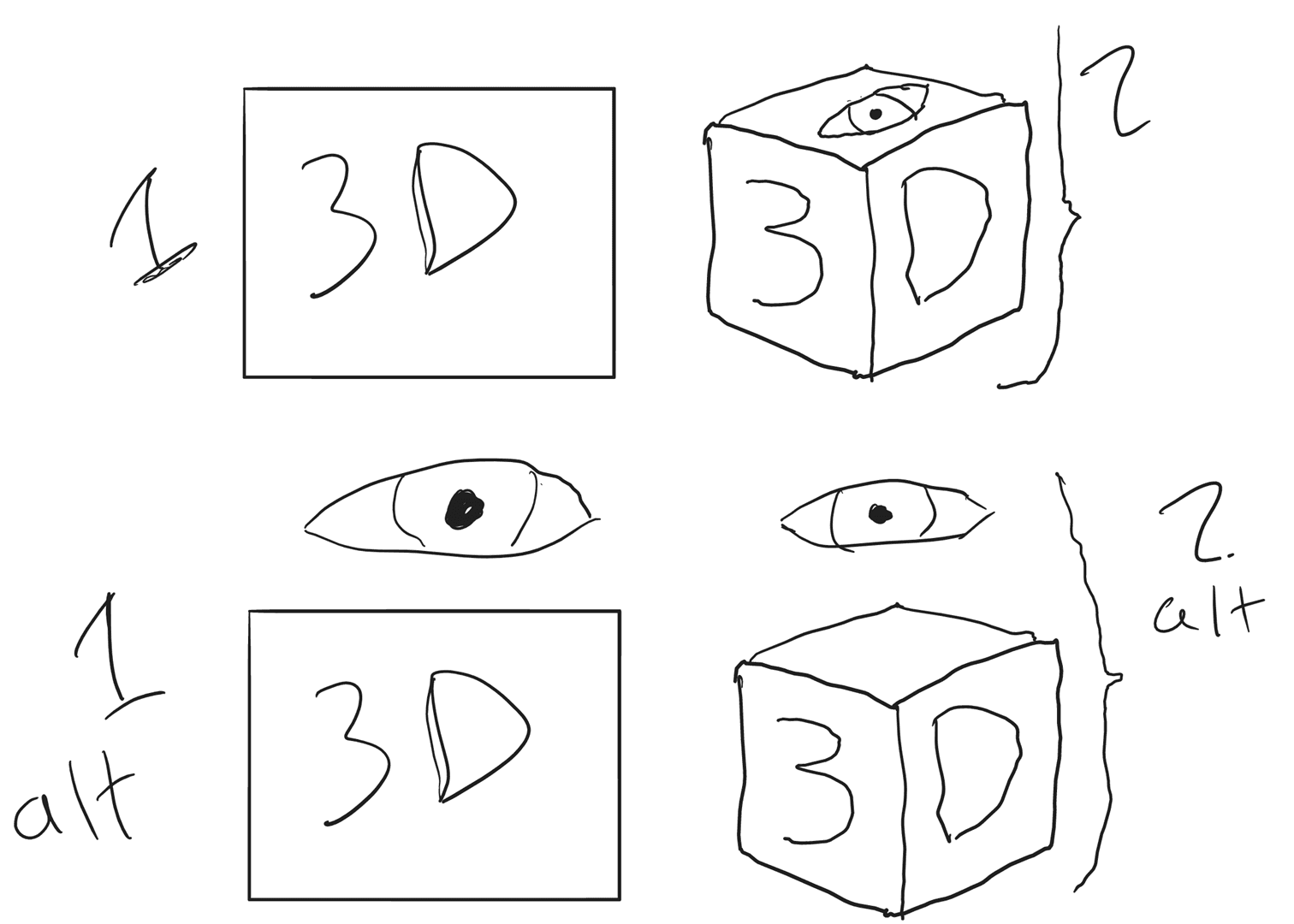
Sketch of 3D-Icon
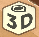
Final 3D-icon design
Click here to try the final concept!
References
Norman, Donald A. The design of everyday things Revised and expanded
edition. : New York, NY : Basic Books, 2013 - xviii, 347 p. ISBN:
9780465050659 (pbk.) LIBRIS-ID: 14832677)
Ware, Colin. Visual thinking for information design [Elektronisk resurs]Morgan
Kaufmann Publishers, 2021, LIBRIS-ID: crm6fjtc922xw0vk
Georgeson, Mark A.; Green, Patrick R.; Bruce, Vicki, Visual Perception:
Physiology, Psychology, & Ecology [Elektronisk resurs], Psychology Press,
2014, LIBRIS-ID: 21136553
Lim, Y.-K., Stolterman, E. and Tenenberg, J. (2008). The anatomy of
prototypes. ACM Transactions on Computer-Human Interaction, 15(2), pp.1–
27. doi:10.1145/1375761.1375762.